-
About
We Are

Our marketing presence in the US and Australia speaks volumes about our expertise and ability to complete successful projects.
History
After working with a plethora of clients, we have left our mark in the digital world. Using technology as our foundation, we offer our clients complete satisfaction. Our team of skilled website developers and digital marketing experts employ the most up-to-date technologies and tried-and-true tactics to design user-friendly business websites and dynamic online applications, as well as promote them to increase client reach.
-
Consulting
We Are Consulting With
Digital Solutions

Deep-dive into your data and boost business performance by understanding what your users really want.
Idea
Reach out to us for the best technological solutions, so that your project gains the proper wings to fly and soar in the competitive market. Remember that your website is an essential part of your company. It should match your brand's aesthetic while also encouraging your intended audience to trust you. Our bespoke web design services are the result of hard work and joint effort.
-
Services
Our Services
What We Provide

Creating awesome web application using advance technology with focus of measurable ROI. Robust, Reusable, Futuristic.
Motive
Join us and watch your project grow by leaps and bounds. We ensure that you stay updated to watch the complete evolution of your project. We construct SEO friendly, mobile responsive websites exactly matched to your requirements as India's top web development business. We offer comprehensive services for planning, creating, and maintaining a successful web presence for your company. You can choose the most suited web development services for your requirements.
-
Hire Experts
We Are Hiring
Selection

We have an experienced team of trusted Indian developers, who are well-known for their innovative solutions.
Scope
As our team develops your project, you will be pleasantly surprised to see what amazing wonders we can create for you. We ensure the top-quality web design solutions at reasonable pricing as a premium website design company to help your business prosper online. Our professional web developers can establish and enhance your online presence in a variety of ways, from a small business informational website to a feature-rich eCommerce store to enterprise-level custom web application development.

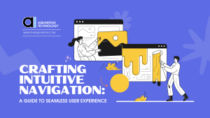
Crafting Intuitive Navigation: A Guide to Seamless User Experience
Introduction
In today’s dynamic digital landscape, user experience in web page designing reigns supreme. Central to this is the art of intuitive navigation. A website’s success hinges on its ability to guide users seamlessly through its content. This article serves as a comprehensive guide to crafting navigation that feels instinctive and effortless. We’ll explore the principles, strategies, and case studies that underpin intuitive navigation. By the end, you’ll be equipped with the knowledge and tools to create a user-friendly website that not only engages but converts. So, let’s embark on this journey towards a more seamless user experience.
The Significance of Intuitive Navigation
In an era of fleeting attention spans, the navigational ease of a website holds paramount importance. A complex navigation structure in web page designing risks losing users within seconds. Intuitive navigation ensures users swiftly find what they seek, resulting in higher engagement and increased conversion rates. It’s the digital equivalent of a well-marked path in a dense forest – it keeps users on track, preventing frustration and abandonment. This significance is underscored by the fact that a user’s initial interaction with a website often determines whether they stay or leave. Thus, intuitive navigation stands as the cornerstone of a successful online presence.
Understanding User Behaviour
Understanding user behaviour is akin to holding the keys to a successful online presence. It is the cornerstone upon which intuitive navigation is built. Research indicates that users favour clear, organised layouts that guide them through content effortlessly. They appreciate interfaces that anticipate their needs, presenting information in a logical sequence. Users tend to follow a predictable path, starting with an overview of the page before delving into specific sections. This insight forms the bedrock for crafting navigation that aligns with their natural flow.
Moreover, studies have shown that users are drawn to visually engaging elements, such as clear headings and concise labels. They tend to skim-read, seeking out key information that aligns with their goals. Understanding these tendencies allows for the strategic placement of critical content, ensuring it catches the user’s eye.
User behaviour is also influenced by the device they are using. Mobile users, for example, may have different expectations and preferences compared to desktop users. Ensuring that navigation remains seamless across various platforms is crucial in accommodating this diversity.
In essence, comprehending user behaviour is a dynamic process that involves continuous observation, analysis, and adaptation. By placing the user at the centre of design decisions, websites can create an experience that feels tailor-made, resulting in higher engagement and increased conversions. It’s this intimate understanding of user behaviour that sets the stage for truly intuitive navigation.
Principles of Intuitive Navigation
Clear Hierarchy
A well-structured information hierarchy is the backbone of intuitive navigation. Headings, subheadings, and menus should mirror the user’s thought process, providing a clear path to desired content.
Consistency in Design
Uniformity in design elements, including colour schemes, fonts, and button placement, fosters familiarity. Consistency breeds predictability, making navigation feel intuitive and comfortable for users.
Effective Use of Labels
Concise yet descriptive labels are crucial. Ambiguous terms lead to confusion. A well-labelled navigation menu guides users without leaving them guessing.
Intuitive Navigation Tools
Features like breadcrumbs, search bars, and interactive elements provide additional means for users to locate their desired content with ease. These tools augment the overall navigational experience.
Mobile Responsiveness
With a significant portion of internet traffic originating from mobile devices, ensuring seamless navigation on smaller screens is imperative. Responsive design guarantees a consistent experience across all devices, further enhancing user satisfaction.
Testing and User Feedback
User testing and feedback are invaluable in refining navigation. Conducting usability tests identifies pain points and gathers insights for improving user experience. Listening to user feedback helps fine-tune navigation for optimal results.
Optimizing for SEO
Intuitive navigation not only enhances user experience but also impacts SEO positively. Search engines favour sites with clear navigation structures, resulting in improved visibility, higher rankings, and increased organic traffic.
Navigational Pitfalls to Avoid in Web Page Designing
Creating an intuitive navigation system in web page designing requires a keen understanding of what not to do. Avoiding common navigational pitfalls is as crucial as implementing effective strategies. One of the most prevalent mistakes is overloading menus with an excessive number of options. This overwhelms users and makes it challenging to find what they’re seeking. Instead, opt for a streamlined menu structure that prioritises key sections.
Another misstep is the overuse of dropdown menus. While dropdowns can be useful, an excess of sub-menus can lead to frustration and confusion. It’s imperative to strike a balance, ensuring that dropdowns are intuitive and easy to navigate.
Neglecting to incorporate a search function is a grave error in navigation design. A search bar serves as a beacon for users looking for specific information. Without it, users may feel stranded, leading to a higher bounce rate.
Furthermore, failing to consider mobile responsiveness is a significant pitfall. In today’s mobile-centric world, a website must be as user-friendly on a smartphone as it is on a desktop. Neglecting mobile optimisation can result in a loss of a substantial portion of the audience.
Lastly, using vague or overly complex labels can lead to confusion. Labels should be clear, concise, and descriptive, providing users with a clear understanding of what to expect when they click.
By steering clear of these navigational pitfalls, you’ll pave the way for a seamless user experience. Prioritising simplicity, clarity, and responsiveness ensures that users can effortlessly navigate your website, resulting in higher engagement and conversions.
Keeping Navigation Fresh
In the ever-evolving digital landscape, keeping navigation fresh in web page designing is paramount. As trends shift and user expectations evolve, a website’s navigation must adapt to stay relevant. Regular reviews and updates ensure that it aligns with current best practices. This process involves evaluating user feedback, monitoring emerging design trends, and considering any changes in content structure. By proactively maintaining intuitive navigation, you not only enhance the user experience but also demonstrate a commitment to providing valuable, up-to-date content. This dynamic approach ensures that your website remains a trusted and engaging destination for users, fostering long-term relationships and sustaining success.
Conclusion
Crafting intuitive navigation is an art that harmonises user psychology with design principles. Prioritising the user’s journey leads to enhanced engagement, improved conversions, and ultimately, a thriving online presence.
-
14
+Category
-
98
+Post
Top Categories
Popular Posts
- The Power of Prototyping in Software Development
- Version Control Best Practices for App Development
- Understanding Visual Hierarchy: A Guide to Effective Design
- Crafting Intuitive Navigation: A Guide to Seamless User Experience
- Choose Your Best Cloud Provider
- Making the Leap: Transitioning from Manual to Automated Software Testing
- Using GitHub- Advantages and Disadvantages
- E-commerce Product Photography on a Budget
- Tech Innovation in Developing Countries
- Smart Cities: How Technology is Shaping the Urban Landscape
- Principles of Composition: Creating Visual Harmony with Composition
- Exploring Cross-Platform App Development
- Why Regular Website Updates Matter
- Navigating Effective Facebook Audience Targeting
- Implementing Ads for Game Monetization
- Designing User-Centric Mental Health Apps: Enhancing Well-being in the Digital Age
- NFTs and Collectibles: Creating NFT App Solutions for Collectors and Enthusiasts
- Successful Implementation of Enterprise Apps
- Maximizing Business Impact with EQ
- Proven SMO Ads Optimization Tips (2023)
