-
About
We Are

Our marketing presence in the US and Australia speaks volumes about our expertise and ability to complete successful projects.
History
After working with a plethora of clients, we have left our mark in the digital world. Using technology as our foundation, we offer our clients complete satisfaction. Our team of skilled website developers and digital marketing experts employ the most up-to-date technologies and tried-and-true tactics to design user-friendly business websites and dynamic online applications, as well as promote them to increase client reach.
-
Consulting
We Are Consulting With
Digital Solutions

Deep-dive into your data and boost business performance by understanding what your users really want.
Idea
Reach out to us for the best technological solutions, so that your project gains the proper wings to fly and soar in the competitive market. Remember that your website is an essential part of your company. It should match your brand's aesthetic while also encouraging your intended audience to trust you. Our bespoke web design services are the result of hard work and joint effort.
-
Services
Our Services
What We Provide

Creating awesome web application using advance technology with focus of measurable ROI. Robust, Reusable, Futuristic.
Motive
Join us and watch your project grow by leaps and bounds. We ensure that you stay updated to watch the complete evolution of your project. We construct SEO friendly, mobile responsive websites exactly matched to your requirements as India's top web development business. We offer comprehensive services for planning, creating, and maintaining a successful web presence for your company. You can choose the most suited web development services for your requirements.
-
Hire Experts
We Are Hiring
Selection

We have an experienced team of trusted Indian developers, who are well-known for their innovative solutions.
Scope
As our team develops your project, you will be pleasantly surprised to see what amazing wonders we can create for you. We ensure the top-quality web design solutions at reasonable pricing as a premium website design company to help your business prosper online. Our professional web developers can establish and enhance your online presence in a variety of ways, from a small business informational website to a feature-rich eCommerce store to enterprise-level custom web application development.

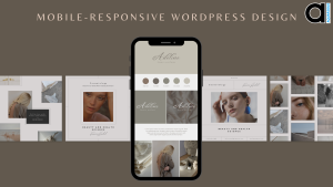
Mobile-Responsive WordPress Design
In modern technology, businesses and individuals need a website that seamlessly adapts to mobile devices. As the number of mobile users continues to rise, it becomes imperative to guarantee that your website is fully optimized for mobile viewing.
What is Mobile-Responsive Design?
Mobile-responsive design encompasses crafting websites that effortlessly conform and adjust to diverse screen sizes and resolutions, delivering an unparalleled viewing experience across various devices, including smartphones and tablets. By employing mobile-responsive design techniques, websites can dynamically adapt their layouts, content, and images to perfectly suit the screen dimensions, guaranteeing optimal readability and usability.
Importance of Mobile-Responsive Design
In the era of smartphones, the importance of mobile-responsive design cannot be overstated. Mobile devices have become the primary means of internet access for many users. If your website is not mobile-friendly, you risk alienating a significant portion of your audience and losing potential customers. It improves user experience, increases engagement, and enhances your website’s credibility.
Mobile-Responsive Design and SEO
Mobile-responsive design plays a vital role in search engine optimization (SEO). Search engines like Google prioritize mobile-friendly websites in their rankings. A mobile-responsive WordPress design can boost your website’s visibility, organic traffic, and overall SEO performance. With a mobile-responsive website, you provide a seamless browsing experience for desktop and mobile users, contributing to better search engine rankings.
Best Practices for Mobile-Responsive WordPress Design
When implementing a mobile-responsive design in WordPress, there are several best practices to follow:
Choosing a Mobile-Responsive WordPress Theme
Selecting a mobile-responsive WordPress theme is the first step towards creating a mobile-friendly website. Look for themes that explicitly state their responsiveness and offer a preview of how they look on different devices. Hire WordPress developer who will regularly update and support your chosen theme.
Optimizing Images for Mobile-Responsive Design
Images are integral to any website but can significantly impact mobile loading times if not optimized correctly. Compressing images, using the appropriate file formats, and specifying image dimensions can help improve the performance of your mobile-responsive website.
Content Formatting for Mobile Devices
When designing content for mobile devices, it’s essential to consider the limited screen space. Break up long paragraphs, use subheadings, and use bullet points to improve readability. Additionally, ensure that fonts and font sizes are legible on smaller screens.
Navigation and Menus for Mobile Users
Navigation is crucial on mobile devices, as users typically rely on touchscreens to navigate a website. Implement a user-friendly mobile menu that is easy to access and navigate. Consider using a “hamburger” menu icon and prioritize the most critical links for mobile users.
Testing and Optimizing Mobile-Responsive Design
Regularly test your website’s mobile responsiveness across various devices and screen sizes. Utilize tools like Google’s Mobile-Friendly Test to identify any issues or areas for improvement. Optimize load times, fix layout inconsistencies, and ensure all interactive elements function correctly on mobile devices.
User Experience Considerations
When designing for mobile devices, user experience should be a top priority. Consider the context in which users access your website on mobile devices and tailor the experience accordingly. Ensure that forms are easy to fill out, buttons are appropriately sized for touch, and content is presented user-friendly.
Common Mistakes to Avoid
While striving for mobile-responsive design, it’s essential to avoid common mistakes that can hinder the user experience. These include using pop-ups that cover the entire screen, employing intrusive interstitials, and using fonts that are difficult to read on small screens. Minimize the use of Flash and avoid using non-responsive plugins. It is advisable to approach the best digital agency in the industry and hire WordPress developer who is an expert.
Mobile-Responsive Design Plugins
WordPress offers a variety of plugins specifically designed to enhance the mobile-responsive design. These plugins can provide additional functionalities and features to ensure a seamless mobile browsing experience. Here are a few popular mobile-responsive design plugins worth considering:
WPtouch
WPtouch is a highly regarded plugin that instantly transforms your WordPress website into a mobile-friendly version. It offers a range of elegant and customizable mobile themes that adapt to different devices. WPtouch also provides options for optimizing images, managing mobile ads, and integrating touch-friendly navigation menus.
Jetpack
Jetpack is a comprehensive plugin that offers numerous features, including mobile responsiveness. With its mobile theme module, Jetpack automatically detects when a visitor uses a mobile device and delivers a mobile-optimized version of your website. Jetpack also provides tools for improving performance, security, and social sharing.
WP Mobile Edition
WP Mobile Edition is a lightweight plugin designed to create a mobile-friendly version of your WordPress website. It offers a simple and clean mobile theme that loads quickly on mobile devices. WP Mobile Edition allows you to customize the appearance of your mobile site, including fonts, colours, and logos.
AMP for WP
The AMP (Accelerated Mobile Pages) for WP plugin focuses on improving mobile page loading speed. It creates lightweight versions of your web pages that load almost instantly on mobile devices. AMP for WP supports various customization options and integrates seamlessly with Google AMP, ensuring optimal mobile performance.
Elementor
Although primarily known as a page builder plugin, Elementor offers mobile-responsive design capabilities. With Elementor, you can easily create visually appealing and mobile-friendly layouts using its intuitive drag-and-drop interface. It provides responsive design options and lets you preview your designs on different device sizes.
These plugins can help you achieve mobile responsiveness with minimal coding or technical expertise. Depending on your specific needs, consider exploring these plugins and choosing the one that best aligns with your website’s requirements. Install and activate only the necessary plugins to avoid excessive bloat and maintain optimal website performance. If you want to hire WordPress developer, make sure they are well acquainted with the plugins and keep themselves up to date with the changing industry.
Conclusion
In today’s mobile-driven world, having a mobile-responsive WordPress design is no longer optional but necessary. It improves user experience and contributes to better search engine rankings. By implementing best practices for mobile-responsive design, optimizing images and content, and considering user experience, you can create a website that engages and converts visitors, regardless of their device.
If you’re looking to hire WordPress developer to assist you with your mobile-responsive design and other website development needs, consider Aquarious Technology. Aquarious Technology specializes in providing top-notch WordPress development services, offering a team of skilled developers who are well-versed in creating mobile-responsive websites on the WordPress platform. Whether you need custom theme development, plugin integration, or optimization for mobile devices, Aquarious Technology can provide expert assistance. Their experience and expertise can help you achieve a seamless and engaging mobile experience for your website visitors.
-
14
+Category
-
98
+Post
Top Categories
Popular Posts
- The Power of Prototyping in Software Development
- Version Control Best Practices for App Development
- Understanding Visual Hierarchy: A Guide to Effective Design
- Crafting Intuitive Navigation: A Guide to Seamless User Experience
- Choose Your Best Cloud Provider
- Making the Leap: Transitioning from Manual to Automated Software Testing
- Using GitHub- Advantages and Disadvantages
- E-commerce Product Photography on a Budget
- Tech Innovation in Developing Countries
- Smart Cities: How Technology is Shaping the Urban Landscape
- Principles of Composition: Creating Visual Harmony with Composition
- Exploring Cross-Platform App Development
- Why Regular Website Updates Matter
- Navigating Effective Facebook Audience Targeting
- Implementing Ads for Game Monetization
- Designing User-Centric Mental Health Apps: Enhancing Well-being in the Digital Age
- NFTs and Collectibles: Creating NFT App Solutions for Collectors and Enthusiasts
- Successful Implementation of Enterprise Apps
- Maximizing Business Impact with EQ
- Proven SMO Ads Optimization Tips (2023)
